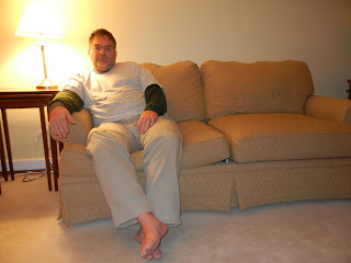
I wanted to experiment with a few settings on my camera since we would be inside with little light. I was hoping to see what the same shot would look like with different settings and with and without using the flash.
My basic idea was to have him sit alone on the couch with just the light from one lamp sitting to his right. Again, no tripod (I ordered one today, I promise) so I tried to prop my elbows on a low table.
With a flash...
...without a flash...
...with a flash again.
First of all, it seems that not only do I have the shakes and can only take blurry photos, but it also seems that I'm incapable of holding the camera straight. Every shot is crooked.
Blurry crookedness aside, I decided to work with this photo.
That is one tired, tired man.
I wanted the harsh light on his face, but without the flash to brighten the rest of the scene, the lamp is completely blown out. I'll have to figure out how to make it work so that I can get the light on his face AND see the lamp shade.
I decided to work with it anyway as if I'd planned it that way.
The first thing I did was straighten the photo, and then I desaturated and took out some of the yellow tint.
I like how lonely he looks.
I mean, I don't like that he's lonely, but within the context of this assignment, I think it works.
Next I tried some different cropping options. I am fascinated by how a subtle crop will completely change the feel of a photo.
In this one I tried to accentuate the feeling of the loneliness of being tired.
I made the photo grainy (okay, I was also trying to disguise some of the lack of focus) and desaturated it even more. The result makes it almost look like a sepia tint, don't you think?
In this one I put The Robb on the other side and let the harshness of the light tell the story.
I increased the shadows and highlight to almost distort his face. I do like that you can still tell that he's staring blankly at the floor.
I've been doing some reading on photography as I've been working on these assignments. All of the articles seem to say that the rules (of composition, focus, lines, etc.) can be broken to good effect, but that it's important to know how to follow the rule before trying to break it.
I think that this series is a good example of that. I need a tripod, and I need to learn how to take good, clear photos before I can go out and get artsy with these assignments.
I kind of like what I did with an essentially poor photo, but I wish I'd been able to execute the shot as I intended.


I like how in the last one the harshness of the photo editing accentuates the idea behind the photo. If it were crystal clear and perfectly straight I don't feel like it would convey the same message as well.
ReplyDelete