Welcome

52 WEEKS OF PHOTOS, AND THE STORIES BEHIND THEM.

Monday, January 31, 2011

"Sleep" - Tobacco Fields

Up here in New England we have been struggling through the worst winter we've seen in dozens of years. We've had snow followed by severe cold, followed by freezing rain, and sometimes all three have appeared together.

If you're a school-aged kid, it's been great.

The rest of us have been muttering obscenities for weeks.

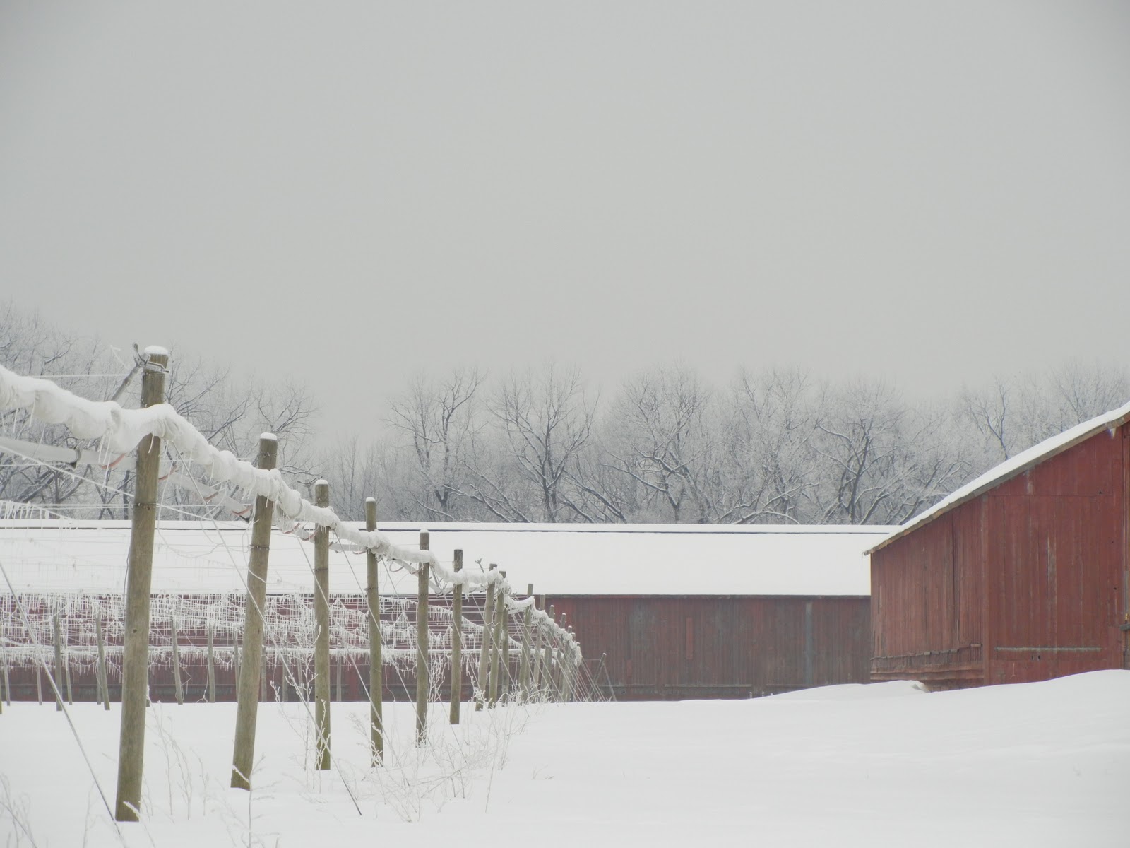
Last week I took a drive out to the tobacco fields the day after another dozen or so inches of snow fell. The assignment for this week is "Sleep", and I thought that the farms really do sleep during the snowy winter months.

I am fortunate to work in the cigar tobacco business, and the wrapper tobacco grown here in Connecticut is widely considered among the best in the world. The tobacco is grown in the steamy summer months under the cover of special netting that gives the delicate tobacco some important shade from direct sunlight, which can burn the leaves.


Unfortunately, the day was very gray and the light was terribly flat, but here is one of the sleeping tobacco fields. The nets are rolled at the top of those posts.

I love the frozen trees in the background of this photo, but they aren't as crisp as I wanted them to be. I was using my sister's monopod to help keep the camera steady, but I was standing it on top of my car to try and keep the trees from being cut off by the nets.

I'm not happy with the perspective, since it looks like the trees are growing out of the nets, but it was the best I could do at the time.


Because the light was so flat to begin with, I ended up increasing the contrast and changing the photo to B&W. There was so little color that making the monotone be part of the shot seemed to make sense.

To continue with the agricultural lesson, once the tobacco is harvested, the leaves are hung to dry in large barns. Traditionally, these barns are red.


Again, the flat light gave me problems, so I tried to correct the blue tint in the snow, increase the saturation of the red barns, and finally I added some depth to the sky.


I'm really happy with how this one turned out. It's still a little blue, but it's much closer to what I was trying to achieve.

Here are a few more looks at the tobacco fields and barns.

I hope you can tell that I was really trying to work on my composition with this one.


Unfortunately, when I looked at it on the computer, I thought that the barn at the back of the photo looked weird in relation to the barn on the right.


I decided to focus on the lines of the posts instead. I desaturated the photo after increasing the contrast. Then I was able to add some blue to the sky to make up for all those pesky clouds.

I'm unhappy with the lack of focus though. I used the monopod (propped in a snow bank) to keep the camera steady, but I still couldn't get a nice, crisp photo. I'll have to work on that.

Same idea here.


Actually, it's the same spot, only a wider shot of it. I left the barn there this time and faked a blue sky again.


I think that the wider angle is closer to what I was looking for as I drove up to the farm. That is a sleeping tobacco farm.

Finally, I wanted to get a look at the inside of the shade structures.


Those strings hanging down are used to fasten the nets, and some are used to support the tobacco plants as they grow.


I loved the lines of the strings to I cropped the photo to focus on those strings (which were frozen, by the way). For the rest, I tried to saturate the barn a little, and increase the contrast to fight the overwhelming gray.

I think I like it, but again, it's not as crisply in focus as I thought it would be.

Now that I have a tripod (three actually - two that I "borrowed" from my sister and one I bought for myself) I hope to figure out how to get these shots in focus.

This is the end of today's lesson on tobacco farming in the Connecticut Valley. Please join us in the Spring when we cover seedlings and planting...

Friday, January 28, 2011

"Tired" - Failures

I'll admit that I didn't expect to be as consumed by this little project of mine as I've clearly become. I am finding myself thinking a couple weeks in advance for ideas of subjects for these assignments, and I surely didn't think that I'd have two, three, or sometimes four photos to write about each week.

Hell, I am pretty surprised that I'm still in the game at all.

However, pursuing multiple ideas for an assignment doesn't necessarily mean that they're all winners. This week has been challenging in particular, so I thought I'd share a few of the subjects I tried that didn't work at all.

First, I was getting ready to put The Boy to bed a few days ago and noticed that his sisters had sat a few stuffed animals in his crib. I thought they looked fun sitting there, so I decided to take a few pictures of them. I majored in English years ago, so I figured I'd be able to make a case for them representing "tired" if I needed to.

Unfortunately, the cute factor of these animals fell to zero in my photos.


I'm afraid they're going to come to life and attack my poor boy in his sleep.

The name "Chuckie" comes to mind...


Gaaah!

Sticking to the "just before bedtime" idea, I also tried to get my oldest daughter to pose for me.

I sat her in my husband's rocking chair with a teddy bear and instructed her to look tired.


Figures. The girl who was cranky and sullen when I asked her to put on her pajamas is suddenly full of smiles when I pull out my camera.

I actually asked her to snuggle her bear in front of her face to disguise her smiles.


Not great, but with a little creative editing, I think this one comes closest to what I was hoping for.


I cropped the shot in a more interesting way, and made it in a sepia tone. I think it makes the photo quieter, which might translate to "tired" a bit better.

I am unhappy with the shadows on the wall behind the chair. I'll have to work on that.

So those are some of my misses. This week was harder than the first few assignments, but I am happy with some of the work I did.

I think this is a nice one, for example.


That's an old shed near my office. I think it looks very tired...

Tuesday, January 25, 2011

"Tired" - The Robb

Anyone who knows me will confirm that I have a serious crush on my husband. I'm crazy about him for so many reasons, not the least of which is that he understands why this project is important to me. He's even given me a few ideas (the Cheerios photo, for example, was his idea), but I doubt he expected that I'd ask him to be the subject himself.

I wanted to experiment with a few settings on my camera since we would be inside with little light. I was hoping to see what the same shot would look like with different settings and with and without using the flash.

My basic idea was to have him sit alone on the couch with just the light from one lamp sitting to his right. Again, no tripod (I ordered one today, I promise) so I tried to prop my elbows on a low table.


With a flash...

...without a flash...


...with a flash again.

First of all, it seems that not only do I have the shakes and can only take blurry photos, but it also seems that I'm incapable of holding the camera straight.  Every shot is crooked.

Blurry crookedness aside, I decided to work with this photo.


That is one tired, tired man.

I wanted the harsh light on his face, but without the flash to brighten the rest of the scene, the lamp is completely blown out. I'll have to figure out how to make it work so that I can get the light on his face AND see the lamp shade.

I decided to work with it anyway as if I'd planned it that way.

The first thing I did was straighten the photo, and then I desaturated and took out some of the yellow tint.


I like how lonely he looks.

I mean, I don't like that he's lonely, but within the context of this assignment, I think it works.

Next I tried some different cropping options. I am fascinated by how a subtle crop will completely change the feel of a photo.


In this one I tried to accentuate the feeling of the loneliness of being tired.

I made the photo grainy (okay, I was also trying to disguise some of the lack of focus) and desaturated it even more. The result makes it almost look like a sepia tint, don't you think?


In this one I put The Robb on the other side and let the harshness of the light tell the story.

I increased the shadows and highlight to almost distort his face. I do like that you can still tell that he's staring blankly at the floor.

I've been doing some reading on photography as I've been working on these assignments. All of the articles seem to say that the rules (of composition, focus, lines, etc.) can be broken to good effect, but that it's important to know how to follow the rule before trying to break it.

I think that this series is a good example of that. I need a tripod, and I need to learn how to take good, clear photos before I can go out and get artsy with these assignments.

I kind of like what I did with an essentially poor photo, but I wish I'd been able to execute the shot as I intended.

Monday, January 24, 2011

"Tired" - The Brown Dog

The assignment for this week is "Tired", which is not to be confused with "Sleep", since that is next week's topic.

I confess that I'm having a hard time with this one. I know what "tired" looks like - I only have to walk past a mirror to see it - but how do I photograph it and make it look interesting?

I am still trying to think of a fun way to complete the assignment, but in the meantime I took a more obvious approach so that I'd have something to show for the week in case I don't come up with any other ideas.

Poor Brown Dog. He was not at all excited to be my subject again.


"Awww, Mom. Do I really have to?"

"Yes, you do. Now, put away the sad face and look tired. Ready. Set. GO!"


~Crickets~

Stubborn dog.

Well, after a whole lot of bullying on my part, I managed a few shots of Brown in his bed. Sadly, it sits in front of our radiator, and I didn't move the bed to have a nicer background. I thought about it, but my window for taking pictures was very narrow, and I didn't have high hopes for his ultimate cooperation anyway.

By sheer coincidence, I managed to get a shot of the dog yawning.


Unfortunately, I had the camera in Portrait mode and wasn't using a tripod (of course), so the focus is poor. The shutter speed isn't fast enough to capture it well. Pity.

Then I managed to get him to put his head down.


If you know my dog you'll recognize that this expression doesn't actually say, "I'm tired."

What it really says is, "I'm so tired of you, Lady," which is not exactly the same thing. See, he's looking at a wall, pretending he finds it interesting, when he's really just hoping I'll go away.

I didn't go away, so he turned his head, hoping the snub would be more effective in another direction.


This is the closest that I was going to get to coaxing a "tired" expression out of Brown Dog, so I used it as my base.

From the start I like the composition along the top and left of the photo, but I decided to crop it just a little.


I also desaturated it a little and tried to get a little more sharpness around his eyes and nose and in his nails.

On the one hand I like that the photo is so monochromatic, but at the same time the vast expanse of brown bothers me.

I tried it in B&W, and I like it better.


I used a filter on the B&W setting (yellow, I think) and I am happy with the effect.

Still, I really wish that radiator wasn't there. If I had Photoshop I'm sure I could blur it out some, but for now I'll just have to live with it.

I'm going to try to find another approach to this assignment. For his sake, I hope it doesn't involve Brown Dog again.

Thursday, January 20, 2011

"Macro" - Fun with Fire

A while ago I mentioned that I went outside recently to find my husband teaching our daughters the finer points of playing with fire.


While I was outside snapping photos, I took some some close-up shots of the flames. I went back to them today and decided to see what kinds of edits I could make.

I chose this photo to play with. I like that it has a few different areas of interest to play with, and a few different textures as well.


Anyone who knows me well can tell you that while I am essentially a quiet, even-keeled person, underneath it all I love me some drama.

As long as it is not part of my own life, that is.

The first part of the photo that jumped out at me on the screen was the bottom center section.


I love how the flames are curling around the lowest stick, but I can also get a peek at the grain of the wood at the top.

Very dramatic, but then I increased the sharpness considerably, as well as the highlight and shadow to make it even more jarring.


The flames are so saturated that they look almost like cartoons, especially at the top. I like it.

For a different approach I went back to the original and made it B&W.


I also added a little graininess to it. I do think it looks pretty neat like this, but it doesn't have the same impact without the color, and it's not wild enough to make up for the lack of color.

I ran the B&W version through a filter and came up with this:


Now, that's dramatic! The flames at the top are distorted enough that they could be flames or smoke.

I like it. It's not something I'd hang in my bedroom, but I think it's really cool.

Going back to the original photo, I chose another section to work on.


This time I decided to isolate the top left corner. It's much more quiet than the first crop I did, so I chose a more traditional shape.


All I did for this one was try to focus on the texture of the log.

I increased the sharpness and made the whole photo a bit brighter. I like that the smoke and flames are an important part of the photo, but the real story is the texture, which makes this shot much quieter than the last.

I didn't want to distort the image to make it more dramatic (like I did before), so the only thing I did to play with it was to switch it to a sepia tone and add a lot of grain.


Hmmmmm. I think it looks interesting and all, but if I hadn't seen the photo before, would I know that those are flames?

I'm not sure, which takes away from the impact of the photo as a whole for me.

That's all I've done so far, but I've already chosen two other parts of the same original photo to work on.

This is the lower left corner:


I like the knot in contrast to the stick above it, and the bubbly flames are just irresistible.

And this one is along the far right side.


I just love that rounded bit of bark.

If you don't hear from me in a few days, please send help. I might need a photo editing intervention...

Tuesday, January 18, 2011

"Macro" - My Eye

I am enjoying a half-day today because of another snow storm. Actually, this one was more of an ice event, which means tricky driving so I was sent home from work early.

I had planned to go outside and take some nice nature shots, but well, it's cold out there. And icy. And the light is very flat. And it's cold.

Instead I decided to set up the living room to take some pictures of my eye. Without a tripod I made a truly comical assembly of tables, children's toys, and mirrors so that I could keep the camera steady and see what was happening on the other side of the camera.

If I hadn't been alone in the house I would have documented it as part of the process.

I took several photos, but had trouble getting the camera to focus on my iris. The closest I came was this one, so I decided to work with it.


Please try to ignore the massive dark circle under my eye, wrinkles, and permanent sun damage. I swear, I didn't spend my youth worshiping the sun. I'm just a ginger.

In order to make the photo more dramatic and interesting in terms of this assignment I decided to essentially crop myself out of it.


So this is the base photo I used to play with.

I like it, if for no other reason than that I effectively took away the tired smudge from below my eye.

Look at me! I suddenly got about 4 more hours of sleep last night!

The first thing I did was try a few basic edits to make the photo prettier.

I made the whole photo a little brighter, increased the contrast, and sharpened it a bit.


Not surprisingly, I like this one a whole lot better. I think that I might have taken a few years off of my eye.

Works for me.

But then again, I'm nothing if not dedicated to realism, so I went back to the original and tried to make it dark and...unpleasant.

I added a lot of sharpness to the lines and edges, made the colors darker, and then I added a whole lot of graininess to it.


I really love this one. Edgy.

Last, I went back to the original again and tried a B&W version of me.

I started with a basic B&W application, then I ran it through a filter, which helped to brighten the eye a bit. A little fiddling with the highlight and shadow, and here's what I had:


I just love the drama of B&W. Everything looks cooler and the contrasts are more pronounced.

In the end, I really like all three edits. I'll be sad when this week is over. Macro shots are my favorite.

Monday, January 17, 2011

"Macro" - Feather

The assignment for this week is "Macro".

I couldn't be more pleased. Over the last few weeks I've been using the Macro setting on my camera like crazy. In fact, one of the first photos I took with the camera was this one.


It's the bracelet I was wearing to work one day. And there it is, sitting on my desk.

I only had the overhead fluorescent lights on and didn't adjust a thing on the computer. Still, I love it because I love the crispness I can see with the Macro setting.

Yesterday I was watching my girls as they played with Play foam.


If you have kids and have not discovered this stuff - do yourself a favor and get some. It's so much fun to sculpt and create with it, and it is blessedly mess-free!

The set we received came with the actual foam and some accessories to decorate your masterpieces. Among the assorted pipe cleaners, google-eyes, and rhinestones was a rainbow of feathers.

I chose the purple one and went to the spot in my living room that has the best natural light.


I took several different pictures, but this was my favorite. I like the movement of it.

The first thing I did was adjust the contrast and colors to make it look more crisp.


I'd placed a white tablecloth behind the feather so I wouldn't have anything else compete with the actual subject, and I was also hoping that the white would bounce some light back at the feather.

In looking at this photo, it bothers me that the downy part of the feather is overwhelming the top, so I decided to crop it to concentrate on the tip of the feather.


Better, I think. The fuzzy corner at the bottom was really distracting me.

I like the photo as-is now, but just for comparison I also decreased the saturation to make the purple a little less electric.


Interesting, I didn't actually expect that bringing the saturation down would help make the lines in that lower left corner more defined.

I can see past the glow of purple now to the feather that was below it. Cool.

I think I'll brave the elements again to take some pictures outside. We are supposed to get an ice storm tomorrow, which could create some beautiful possibilities.